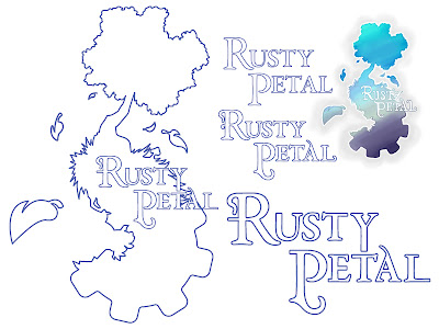
Firstly there was kyles logo for his film which is now called Rusty Petal, he'd drawn the basic logo on paper and scanned it in but wanted a clean version from illustrator. I obviously said yes as kyle doesn't ask just anyone for help. After i set to work it became clear that he type wouldn't work as it was drawn the main problem being the mix of UPPER and lower case. Or possibly i just enjoi playing with type a little too much so following his theme which is organic meets mechanic, i found a soft type face that looked similar to the way it was drawn. Next i added some of the nicer curves by deconstructing the lines and building them up. At this point I'd reached kyles look but thought i could take it further to echo the themes of the film so i started breaking things apart again and adding sharp edges too. Then i traced kyles logo using a mixture of the pen and pencil tool. the finished piece is on the right.
 Once I'd finished Kyle's Ash approached me as he was having trouble coming up with a logo for the coffee shop/name of his film Cafe de Beignet. i looked at what he was going for and quickly drew a design he liked, he took it to the group and they liked it too. So i set to work again this time felling a little freer to experiment. we ended up simplifying the original design to just half a doughnut with the Cafe name and some crumbs, and i had another satisfied customer.
 Now hopefully I'll get back to the blockout on my film.
I'll keep you posted


No comments:
Post a Comment